

Zelene Doline
UX/UI website design
A focused UX/UI case study built around product discovery, clear shopping flows, and a calm organic brand experience.
View live site

Project holder
Madwise
Role
UX/UI design, ecommerce flows and responsive product experience
Year
2026
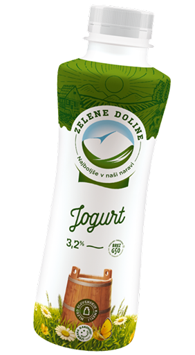
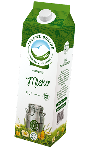
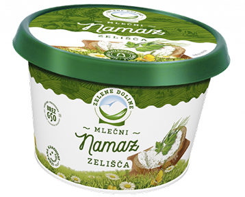
Product story
Natural products, presented with clarity.
Zelene Doline’s range is built around milk, yoghurt, spreads and everyday dairy products. The interface needed to keep that natural product story visible — balancing appetite, trust and clear product discovery across the shopping experience.
UI details
Verified interface details.
Instead of inventing a full design system, this section keeps only the UI treatments that can be shown from supplied project specs and visible interface behavior.
Typography
Verified type contrast
Rockwell Nova / editorial headline
Naše
Open Sans / product emphasis
Izdelki
Button
- Size
- 272 x 60
- Padding
- 6px / 20px
- Radius
- 5px
- Background
- #FFF
Supplied icon system


Supplied SVG icons with consistent green stroke and UI-scale proportions.
Interface rhythm
Green / white contrast
The verified button and icons establish the core interaction contrast.
Label-led browsing
Navigation and product labels stay short, direct and easy to scan.
exact values only where supplied
Wire frame to interface
Wireframe and interface, moving in sync.
A synchronized mobile presentation shows the structure behind the final interface — from content hierarchy and product discovery to responsive shopping flow.

Selected UI moments
Key flows, presented with clarity.
A curated sequence of interface moments shaped around product discovery, trust and everyday usefulness.
01 / Product discovery
Clear navigation helps users quickly understand product lines, benefits and categories.
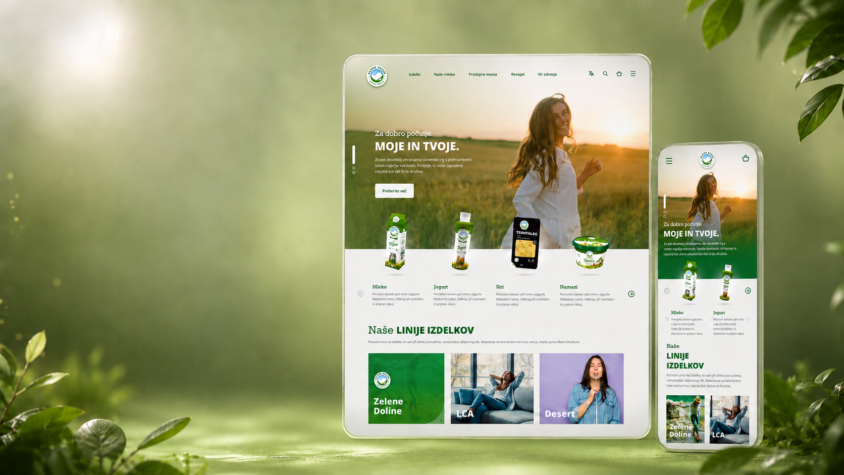
UI showcase
A calm shopping system designed for desktop and mobile.
The webshop experience balances product discovery, responsive browsing and a clear mobile-first flow.
Outcome
From product range to a clearer digital experience.
The Zelene Doline interface organizes a broad product portfolio into a calmer, more intuitive ecommerce experience, connecting product architecture, visual hierarchy and responsive UI into a system that is easier to browse and maintain.