
Logo system
Primary mark, lockup and symbol
Flexible logo logic for brand, retail and interface use.
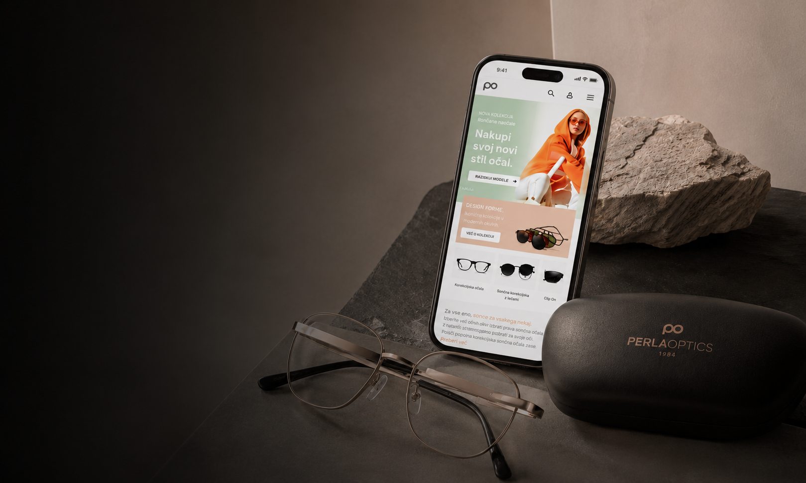
Brand identity and ecommerce UX/UI for a modern optical retailer, carrying one CGP system from logo rules into a working webshop experience.
Project holder
Madwise
Role
Identity system and digital retail design
Year
2024
Project overview
Perla Optika combines a precise visual identity with a full ecommerce experience. The project connects logo rules, color, typography and retail atmosphere with a webshop interface built for product clarity, browsing and conversion.
Brand foundation / CGP system
Perla's CGP defines a softer optical language: Barlow typography, graphite contrast, peach-to-taupe warmth, mint accents and a PO symbol system with clear primary, secondary and usage logic.
Primary colors
#343434
Graphite
#DFB7A1
Perla peach
#C0D8CF
Soft mint
#DFB7A1 → #C69478
Warm gradient
Primary typeface
Barlow
A clean sans-serif voice for CGP documentation, product labels and interface hierarchy.
Aa / 01

Optical retail
Clear product rhythm, soft accents and precise UI labels.
Logo system
Flexible logo logic for brand, retail and interface use.
Colour & type
A restrained palette and readable type system for optical clarity.
Retail consistency
The same visual logic extends into webshop and retail materials.
Logo evolution
Optical geometry, symmetry and simplification were refined into a compact PO symbol that stays readable across brand and retail touchpoints.
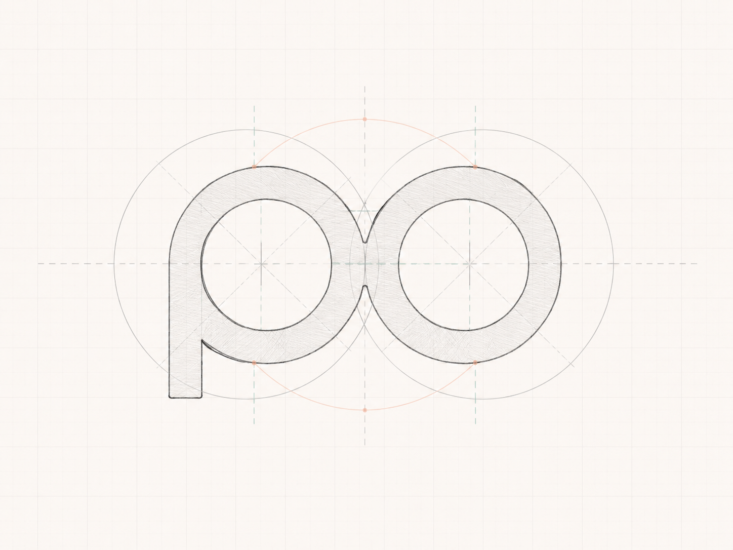
Concept
Sketch logic starts with simplified glasses geometry and a compact PO read.
Final mark
The final mark resolves the same symmetry into a softer, retail-ready identity.
Identity into interface
The identity system carries into the webshop as structure: navigation becomes calmer, actions stay consistent, and product information remains easy to compare across browsing, filtering and checkout moments.
Menus, categories and filters follow the same quiet structure so browsing feels controlled and easy to scan.
Peach accents guide key decisions without overpowering the product photography or interface hierarchy.
Frames, lenses, pricing and product states stay readable across listing, product detail, cart and checkout.
Ecommerce UX/UI system
The webshop is treated as a system, not a screen dump: desktop browsing, mobile filtering, product detail, mobile shopping and checkout moments are curated as one optical retail flow.
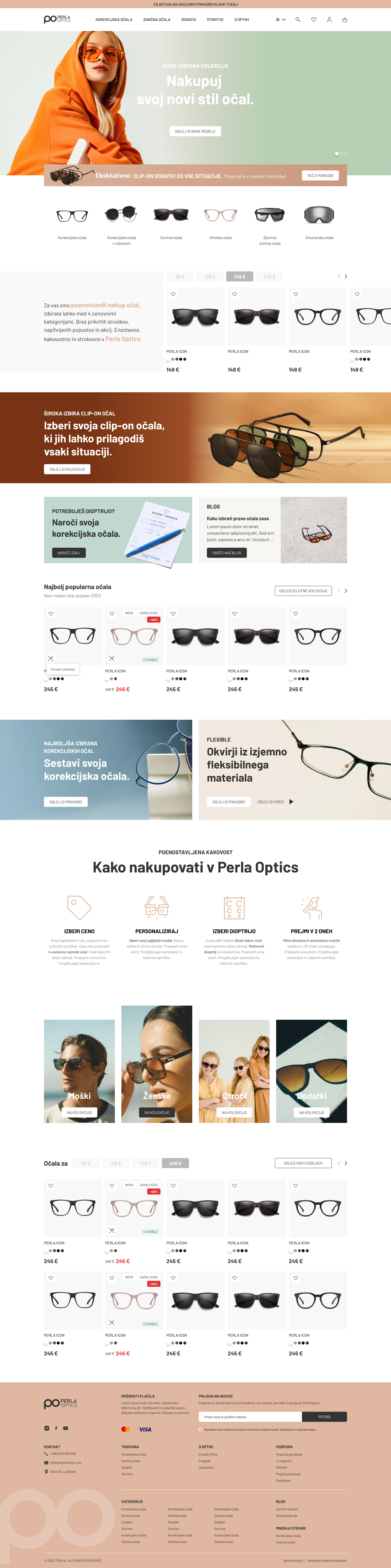
01Storefront
The desktop storefront sets the browsing rhythm, brand tone and first layer of product discovery.
.jpg)
02Filtering
Category filters keep product choice calm, compact and easy to scan.
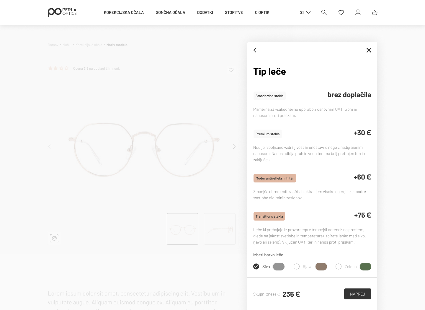
03Product detail
Product detail states clarify frame selection, configuration and price differences.

04Mobile shopping
The mobile layout carries the same retail hierarchy into a long-form shopping flow.
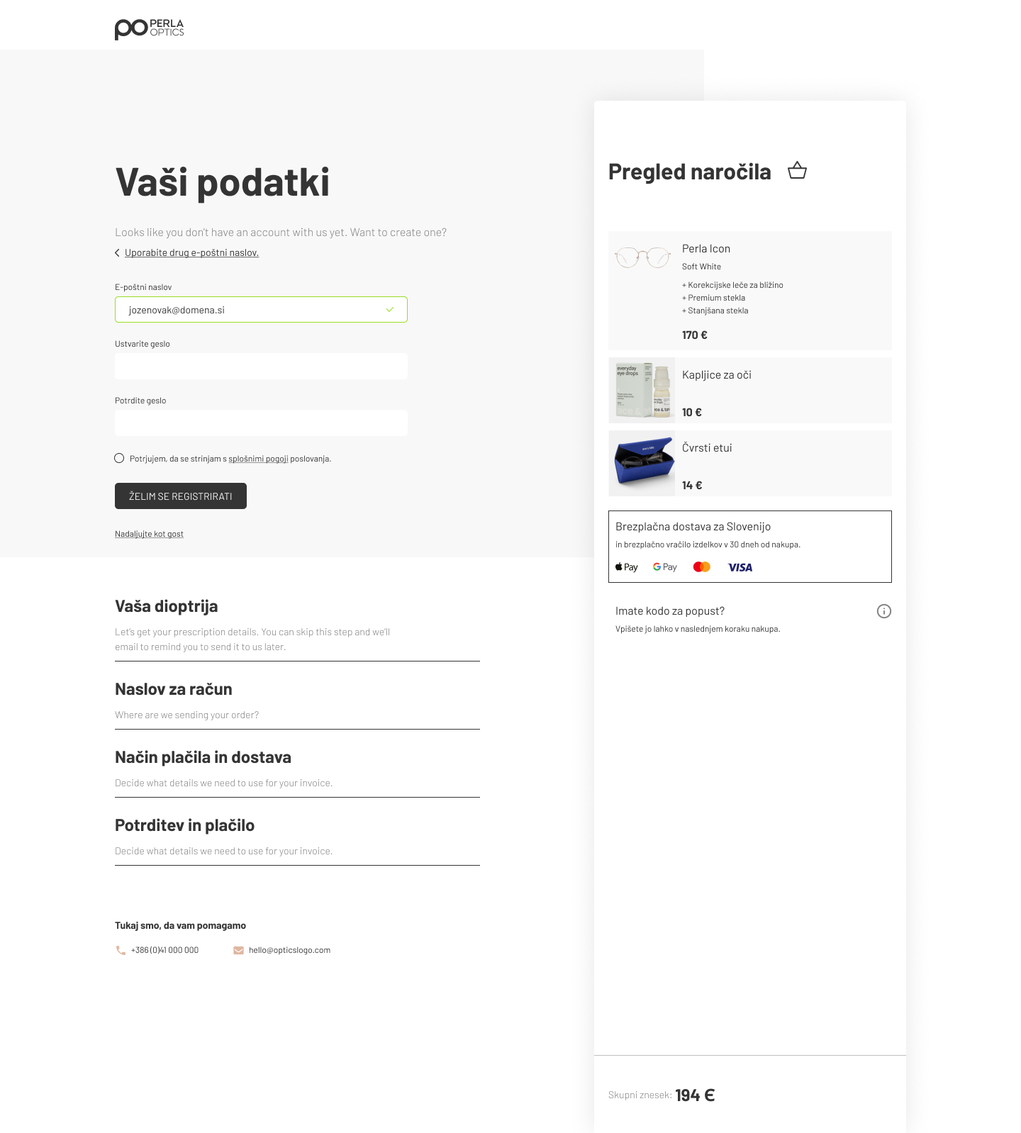
05Checkout
Checkout keeps the same quiet structure at the final decision point.
Brand applications / retail materials
The retail material is kept concise: vehicle graphics, optical case, catalogue atmosphere and branded layout applications show how the identity behaves beyond the webshop.
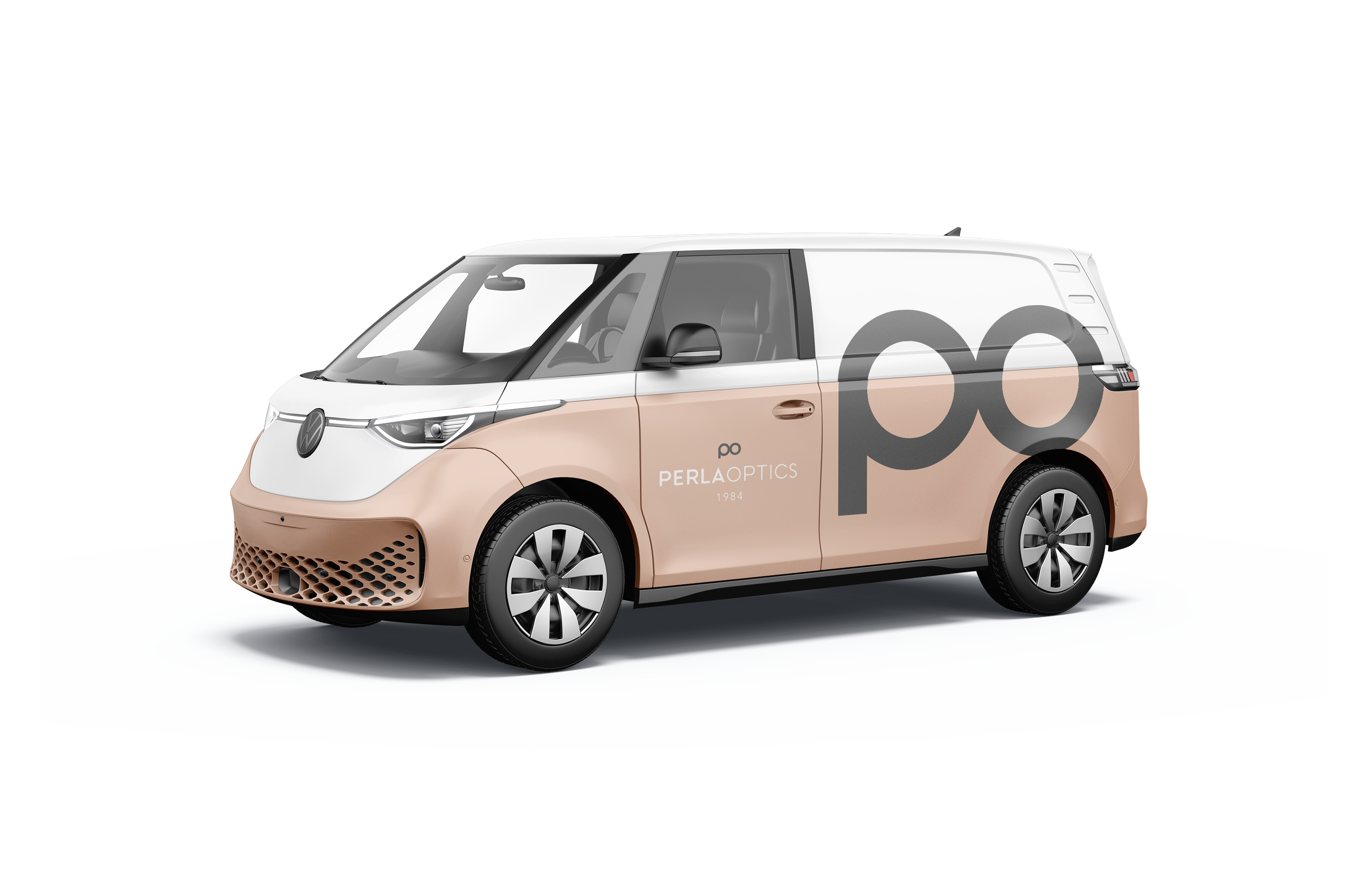
Vehicle graphics
Large-format identity use keeps the mark visible and composed in motion.
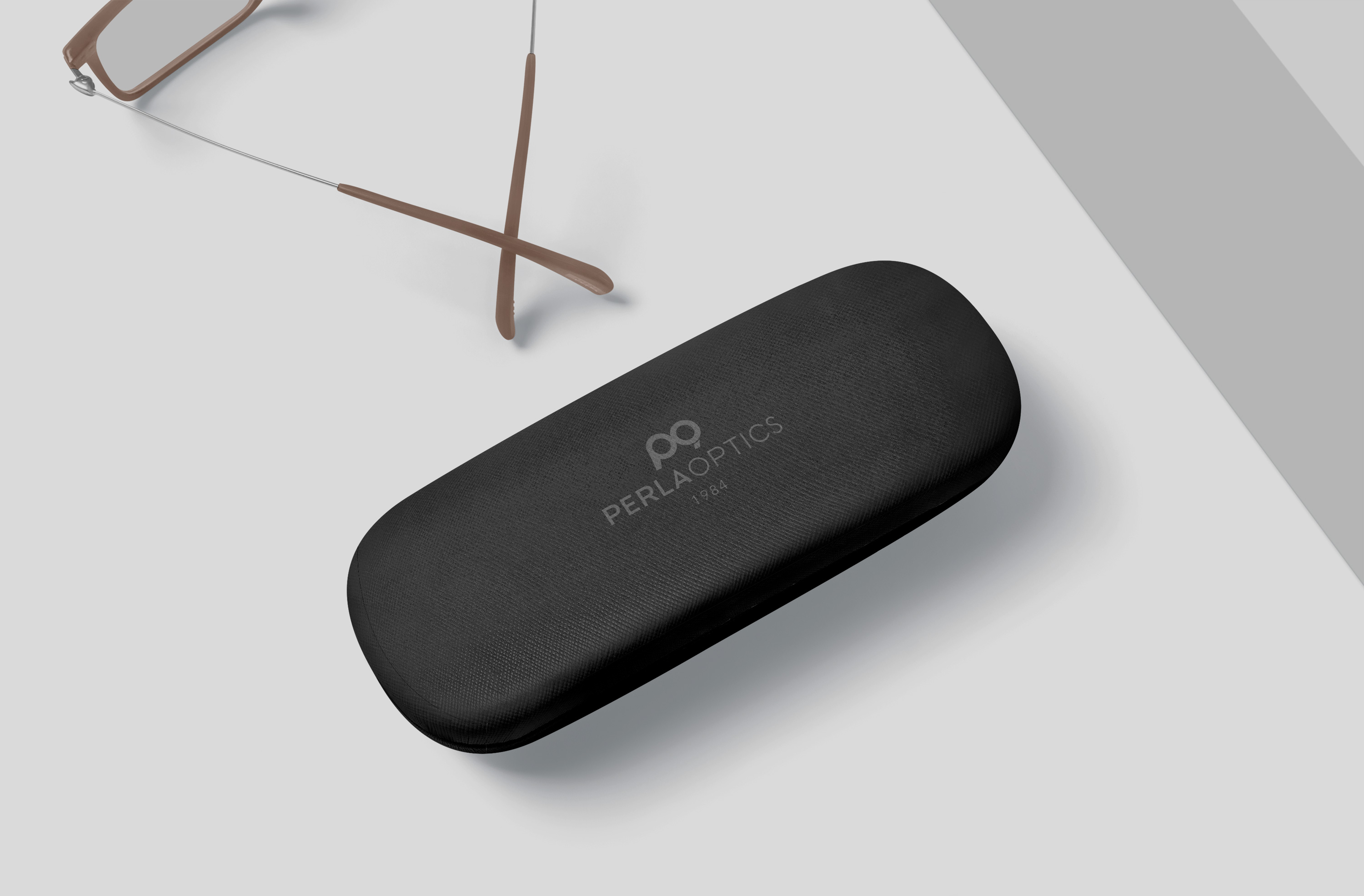
Optical case
Small-format application tests the logo's readability on tactile retail objects.
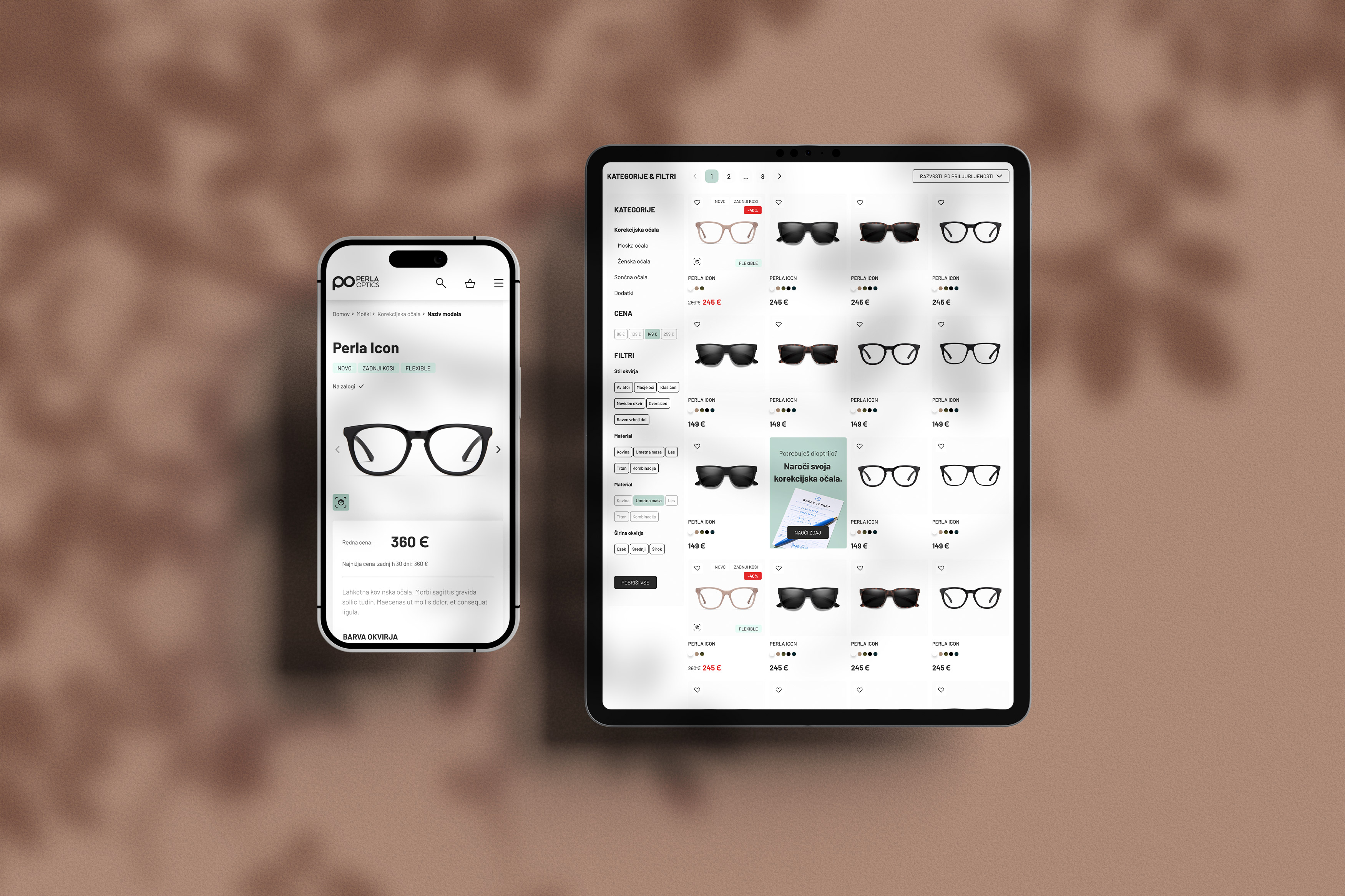
Retail atmosphere
Visual tone carries the brand into campaign and retail-facing touchpoints.
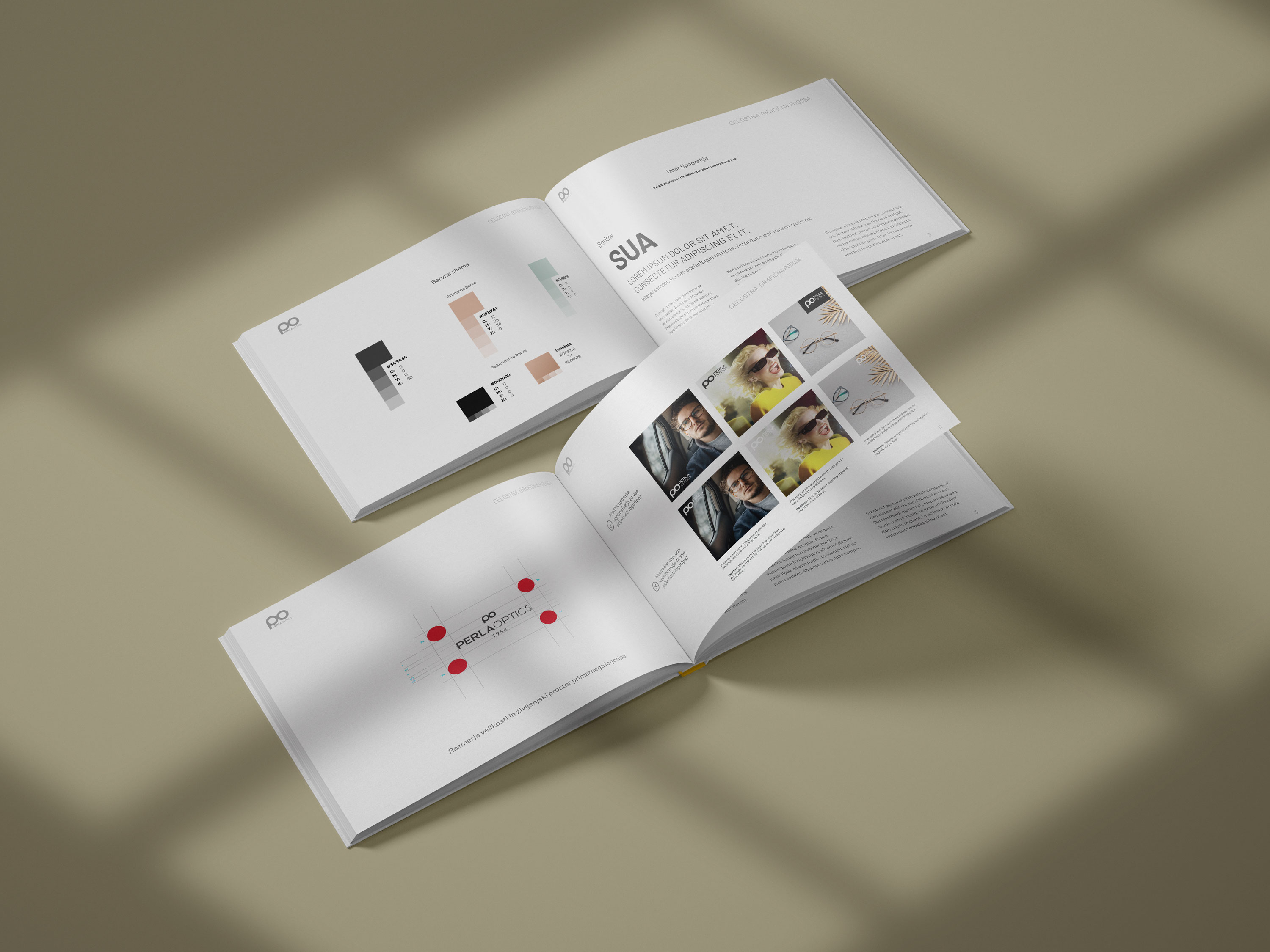
Catalogue system
Printed layouts extend the CGP into structured product presentation.
Outcome
The Perla Optika system connects a precise visual identity with a calm ecommerce experience, carrying logo rules, typography, colour and retail clarity into one coherent brand journey.