
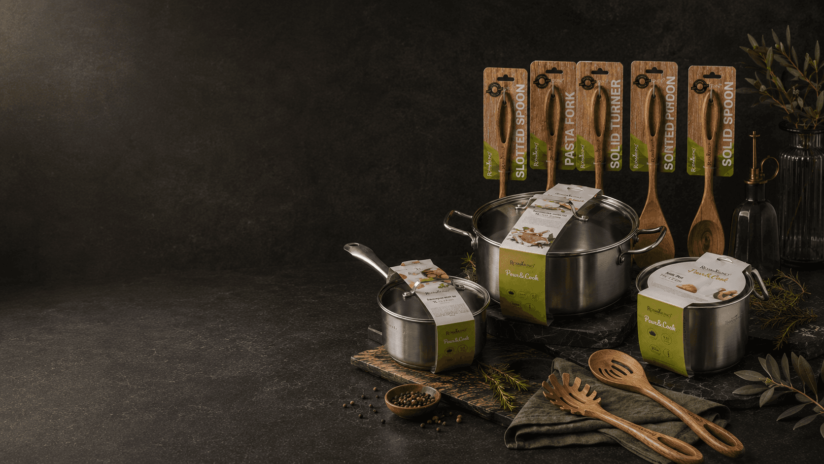
Packaging design / product presentation
Rosmarino Embalaže
A packaging design system for Rosmarino cookware and kitchen accessories, combining product clarity, natural material cues and a consistent premium brand presentation.
Project overview
Two packaging families. One coherent brand system.
This case study brings together two related Rosmarino packaging lines - Pour&Cook cookware and wooden kitchen accessories - into one presentation focused on product clarity, natural material cues and consistent shelf presence.
- Client
- Rosmarino / AD Vita
- Role
- Packaging design, visual system and product presentation
- Year
- —
- Deliverables
- Packaging concepts, product mockups and presentation visuals
Featured visuals
Product clarity with a warmer kitchen atmosphere.
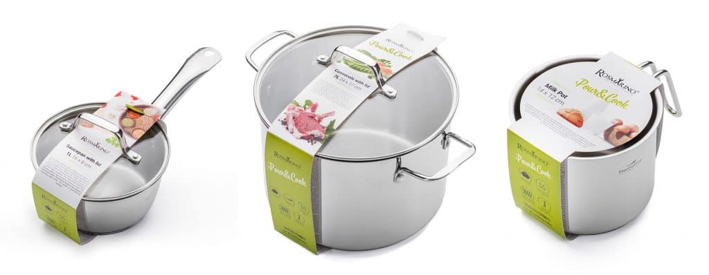
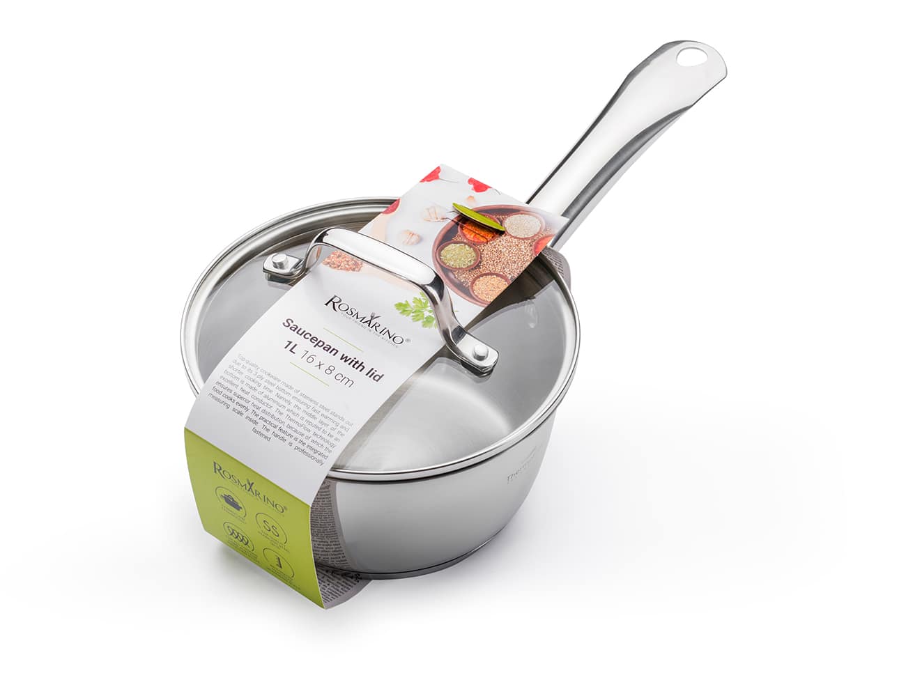
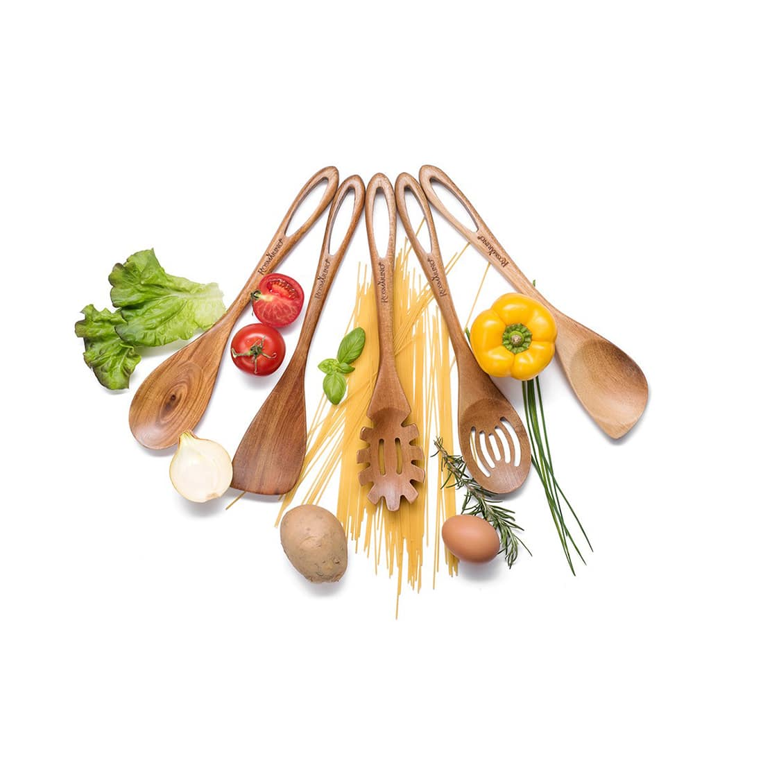
Packaging families
Two collections. One system.
Rosmarino Pour&Cook
Packaging design for a stainless-steel cookware line, focused on clear product communication, practical information hierarchy and a premium kitchen presentation.
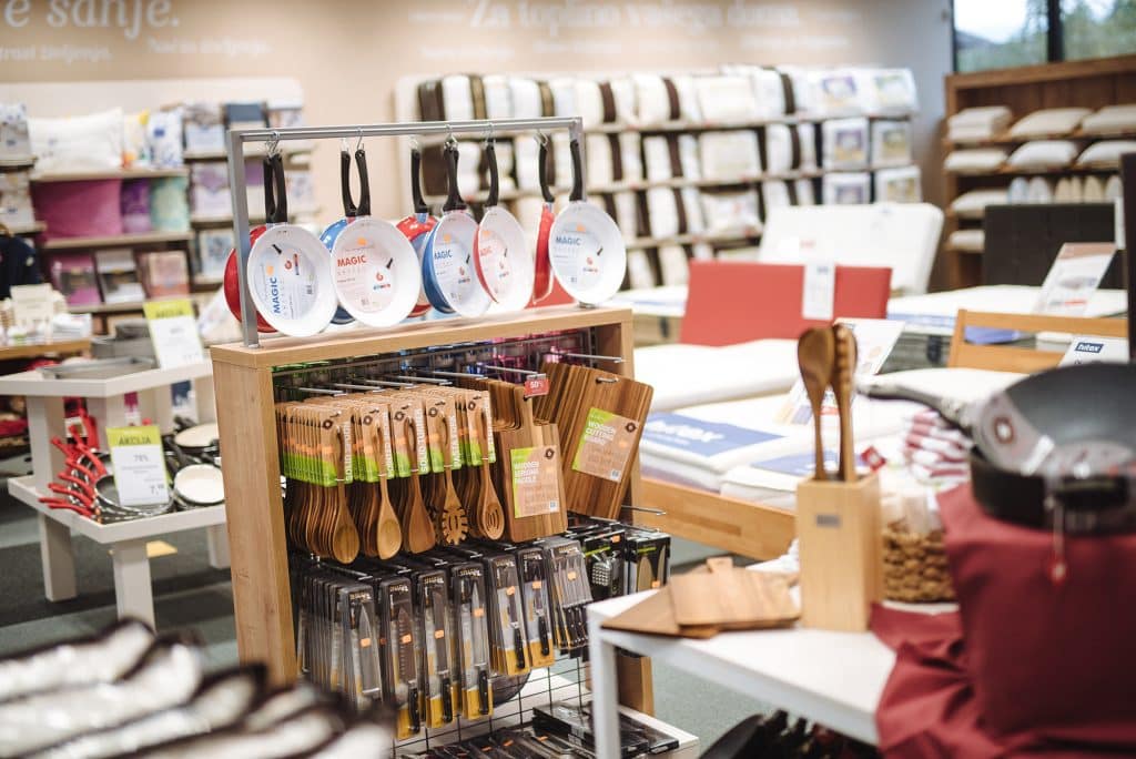
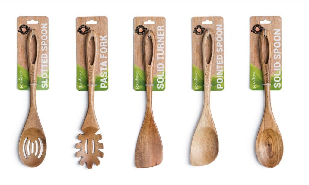
Rosmarino Kitchen Accessories
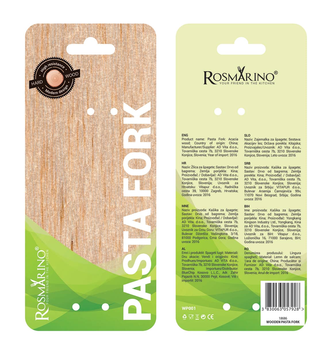
Packaging design for wooden kitchen accessories, combining natural material cues, brand consistency and clear product identification across different tools.
System details
Packaging architecture built on clarity.
Clear communication
Key information stays readable at shelf distance and in ecommerce views.
Natural product language
Material cues and kitchen context keep the packs tactile and warm.
Consistent packaging hierarchy
Shared structure connects different products without making them feel generic.
Final gallery
Selected packaging moments.
Outcome
Thoughtful design. Everyday experience.
The Rosmarino packaging system elevates everyday kitchen essentials through a consistent visual language built around clarity, natural materials and premium product presentation.
Next case
Zelene Doline
UX/UI Website Design